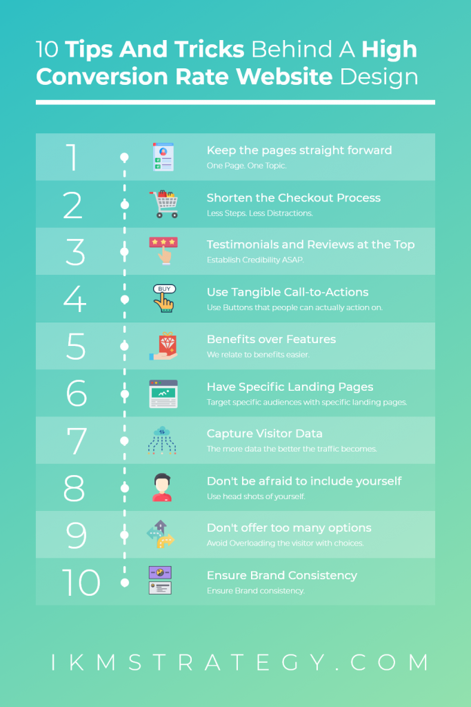
Have you ever wondered what tricks successful businesses employ to convert their visitors? I am here to give you some tips and tricks I’ve used in the past to help my clients secure leads through various page designs.
Here is a quick summary of the tips for a high conversion rate website
- Keep the pages straight forward, 1 topic per page is recommended.
- Keep the checkout process as short as possible.
- Include testimonials near the top of your landing pages to instantly building credibility
- Use Tangible verbs for your call-to-action (Get your…, Take your…) and make it unique.
- State benefits of your service over features. There is a big difference here.
- Have independent landing pages designed for specific ad campaigns! Very important**
- Implement an effective visitor data collection system such as live chat, subscription lists etc.
- Include headshots on your about us page.
- Don’t offer too many options
- Ensure brand consistency.
A majority of the tips above are for a general-purpose which means it doesn’t matter what sort of website you have, but there are a couple of tips that you may have noticed that are specifically for e-commerce websites.
Let’s start with understanding ‘what is conversion?’
The basic definition of conversion is when a visitor to your website does something that you want them to do. That could be:
- Making a purchase;
- submitting a form;
- Calling your business;
- Engaging in online chat; or
- Signing up for a program.
Generally, the most popular metric to look at for a website is the ‘conversion rate’ which is this the number of visitors that your website converts divided by the total number of visitors in a given period. Hence, giving you a good idea of how well your website is doing. Having a conversion rate figure helps you forecast how your business might scale. For example, if your conversion rate is 5%, and you increase your website traffic from 100 visitors a month to 200 visitors a month, you can project that you will get 10 sales instead of 5 sales. The math is very rudimentary, but it serves as a basepoint for some of your business projections.
These tips and tricks I am about to tell you all contribute towards creating a high converting website or a conversion rate optimised website. From here on out, each small improvement can have a massive impact in the long term. A good way to think about this is if you chartered a flight from Melbourne to New York and you altered the flight path angle by 1 degree, You would end up on the other side of America. Small differences make huge impacts when measured over time.
So let’s start.
1. Keeping your page straight forward.
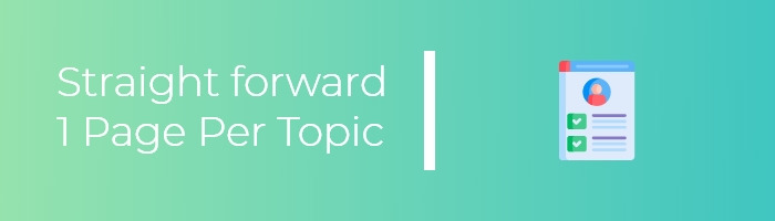
When you visit a website, most of the time you know what you’re looking for. Hence, if you keep your web pages straight forward and limiting them to one topic at a time, it helps the visitors find what they want. Generally speaking, the average time someone stays on a website is 10-20 seconds, and you don’t want them to spend that time searching for the information they want.
Hence, you want to keep your page titles clear, with the correct usage of H1 and H2 tags to ensure that Google is putting the right headings onto its search results. That way, people, will come to the right pages straight away.
In addition to keeping the content structured, you also want to keep the design elements of article pages minimal and not distracting. This means, on blog pages or article pages, you don’t want:
- Fancy transitions
- Javascript Animations
- Heavily-varied Use of Fonts (Keep to maybe 2-3 different font styles at most)
I should also take the time now to mention that you would probably want to keep your navigation menu simple and easy to navigate as well.
2. Keeping the checkout process short.
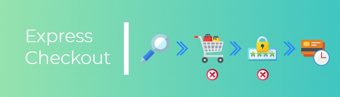
This tip is specifically for people who have e-commerce websites where the desired action of the visitors is to complete a purchase. So, generally in the purchasing process, you have the following stages.
- Find the item you want to buy.
- Add to cart.
- Go to check out page
- Sign in to your account (if you have one)
- Enter your credit card details
- Confirm your purchase.
Immediately, I can tell you to cut out 2 steps. We can get rid of the add to cart page completely and have the button bring the visitor straight to the checkout page. At the same time, we should leave the option for the visitor to log in, but don’t have it as a mandatory requirement. These days, entering your credit card is a pretty fast process, most people have their card details saved to chrome or google and it will automatically fill out once the CVC code is entered in.
Bonus tip: What happens if you manage to get the person to the check out page and upon reviewing the price, they have second thoughts and decide to close the browser tab instead of impulsively buying the item?
Well, this is when you start employing some advanced tracking methods and have a mandatory email field that gets tracked in real-time. Basically, the moment that they enter their email, it will store it into a database. At that point, you can use an abandoned cart email sequence to email them a discount voucher or something to entice them to come back and complete the purchase.
Alternatively, another popular trick is to have a chatbot auto-trigger after 20-30 seconds of that person has been on the checkout page and have not completed their purchase. The chatbot that is triggered will provide the visitor with an extra incentive like a minor 5% discount voucher for you to close the deal and for them to complete the purchase. The reason why it’s 20-30 seconds is that generally, people are pretty fast on the checkout page because they already intend on purchasing the item. If they have second thoughts, they will take longer to think about it and hence, you could use this opportunity to tip them over the edge and close the deal.
3. Include testimonials near the top of your landing pages to instantly building credibility
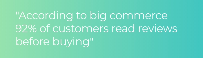
Most people visit websites because they want some sort of information regarding your business. Sometimes, it’s very hard to gain peoples trust online as people are becoming technology savvy and become conditioned to avoid scams online. In Australia, it is the norm to use google reviews as a measure of whether or not the store is trustworthy and if they deliver the services at the quality they say they do. Hence, for your website, you might want to consider listing your google reviews at the very top in order to establish buyer’s confidence in your business first up.
Using testimonials is a good way, but I’ve seen that directly pulling Google reviews seem to have a better effect on conversion rates. For e-commerce stores, this might not apply because the items have their own individual ratings and the users will tend to weight that heavier than the rating of the store. In this scenario, you might want to highlight the reviews that give you positive ratings on the customer service and experience that you provide.
4. Use Tangible verbs for your call-to-action( CTA) (Get your…, Take your…) and Make it unique.
To make the visitor engage with your website, having a tangible action as the CTAs is a must. A lot of people miss out on valuable opportunities because they have one contact us button at the bottom and call it a day. You want to continually introduce CTAs to your visitor to give them an opportunity to react or engage with the material you have provided.
So you have services section of your home page, you want to add a learn more button to it so that it gives them the opportunity to read more about it. I will talk about the use of terms like ‘learn more’ and ‘read more’, shortly. But right now, I want you to always have a CTA at the bottom of the page so that the user ends up working towards it and may reach out to you if they end up liking what you have to offer. This should be for your home page though, the rules for CTA are very different for landing pages.
If you’ve designed a landing page, there should only be one action that you’re pushing the user to do. You should remove the CTA’s linking to read more of the service page or the ‘about us’ page. For landing pages, you want to unify the purpose of all your CTA’s to do one action. That could be:
- buy an item
- sign up
- contact you
- etc.
For landing pages, you want to remove all the chance of them diverging from the goal and have them commit to doing one action only. Hence, unifying where all the CTAs lead. This is also why the bounce rate for landing pages are higher than other pages because when people see they can’t find what they need ie (See more of your products or reviews) they will leave, but there will be a good number of people that you will convert if your landing pages are designed correctly. That will be a topic for
another day.
Regarding the use of generic CTA terms like contact us or learn more, the plus side is that because their more familiar people are willing to engage with it, however, the minus side is that because they’re overused a lot of people automatically filter it out from their vision. There are lists available for other interesting substitutes that you can use. Here is a list of 39 CTA’s examples you can’t help but click prepared by a marketing writer for Hubspot.
5. State benefits of your service over features. There is a big difference here.
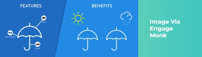
Are you familiar with the difference between benefits and features? If you don’t, do not fret, you’re not the only one. The difference is subtle but the effect is huge.
As humans, we relate to benefits easier than features because they’re more relatable. Let’s take an umbrella for an example.
- A feature would be that it has a steel aluminium frame. The correlating benefit would be that its light.
- A feature would be that it has a 1.5-metre coverage. The correlating benefit would be that is has a greater coverage to shield you from the rain.
At this point, it becomes easier to see that you can relate to the benefits much easier because they directly impact your life and can improve it for you in those ways. If you are selling a service, you would have to make the benefits clear but at the same time, different. These small factors all contribute to a high converting website.
6. Have independent landing pages designed for specific ad campaigns! Very important!
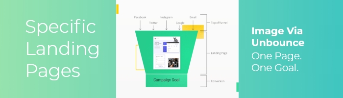
If you’re running ad-campaigns on Google Ads or Facebook ads, you might have noticed that they give you an option to service different audiences with different landing pages. Having specific content that targets a niche audience will be more effective than having general content. This is the same with page design. For a younger demographic, you can really use more complex transitions onto the page to build that brand awareness, but for an older demographic you may want to find limit the transitions as it may impact the usability on older devices.
For accessibility reasons, you may also want to consider altering font sizes and between the different versions. In terms of conversion, serving different video content should also be considered.
7. Implement an effective visitor data collection system such as live chat, subscription lists etc.
A lot of the time, visitors will end up leaving your website because they couldn’t find the content they’re looking for. You can capture the attention of those visitors by using live chat. From my own experience, having a live-chat that pops up with an auto-response is not as effective as just having the icon in the bottom right corner because people tend to find auto-popup live chats to be a bit spammy and a bit annoying. So giving them the option to do so is better in this case.
To add to this, if you have ever used LinkedIn advertising or Google Ads or Facebook(Pixel) there is also the ability to also embed tracking codes on your website which will serve users of your website with a cookie that will allow you to retarget these people with your ads on those platforms. This is more effective because these people have already visited your site before and seeing these ads on the platform might prompt them to check out the new content that you are serving or new products that you are selling.
8. Include head shots on your about us page.
To build point no.3, don’t be afraid to include headshots of people who work there. By including an image of yourself or people from your business you are adding credibility to your website. Although, you do need to make sure that the photos are professional or at least on-brand with your business. You don’t want to be rocking up in a tracksuit for the photoshoot when your business is about delivering professional services.
If you have a one-paged website or a landing page where you include headshots of yourself, it would be ideal to have images of you smiling to show that you are welcoming and kind. If your services revolve around you delivering a majority of the work yourself then this the more important it becomes that the visitor gets a good impression of you.
9. Don’t offer too many options
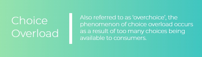
By offering too many options sometimes you overwhelm the visitor and then cause them to be fatigued and distracted when making the decision. Similar to the landing page concept, you want to avoid unnecessary distractions and work towards the goal of converting the visitor.
This idea comes from a famous marketing studying by Sheena Iyengar from Columbia University who set up a table to sell jam outside a grocery store in her town. She tested over a period of two Saturdays and pretended to be a store employee. She set up one stall to sell 24 flavours of jam and the other to sell only 6. From her study, it showed that customers who sampled 24 flavours only 3% of those people purchased, whilst those sampled 6 flavours 30% purchased.
This is a clear demonstration of choice fatigue. When people get overwhelmed they decide to leave. The same thing happens on a website, you want to minimalise your elements and draw attention to the elements that truly matter.
10. Ensure brand consistency.
It is important to maintain brand consistency because it establishes credibility over your website. Imagine having one font type on one page and then another weird font on another page, people start to get confused and the quality of your brand becomes stained.
Branding your business or product won’t happen overnight, but starting is always important. Seeing that the website is what people will see, it is the first place to start. You want a consistent message of your companies core values or strategies. There is a lot in branding strategy so I won’t go into that in this article but you should learn about it once you get the chance.
That was a long read, wasn’t it? If you start implementing some of these tips it will have your website converting more and more visitors. Like I said early, improvements to your web design can’t and shouldn’t be done in one go. If you gradually improve the design with these tips, the quality will follow and then so will the sales and leads that you’ve been looking for.
Some of these tips are geared more towards an e-commerce website where there is generally a physical product to sell. In those circumstances, these tips will serve to add value to your website for sure!
If you like the content, join our mailing list to get the latest updates on our content. We also provide exclusive tips and services to our subscriber! So what are you waiting for, come join now!